Gray oak laminate in the interior. How to use gray laminate in the interior
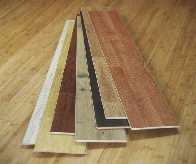
The times when laminate flooring was presented in two or three wood shades in the store are long gone. Today, dozens of manufacturers produce laminate all over the world, and its possible shades and textures number in the hundreds.
In addition to the usual imitation of wood in beige and brown tones, laminate can now imitate natural leather, marble, stone, artistic parquet, slate, travertine, concrete, cement, granite, ceramic tiles, sandstone and other natural textures, and given modern technologies digital photo printing and possible designs on laminate, its color possibilities in the interior become truly limitless.

However, this complicates the task of selecting the color and style of laminate flooring in a room so that it looks harmonious and holistic, does not break away from the general concept and style, fits into the color scheme of the interior, fulfills its purpose and functions, emphasizes the design idea and, if necessary, adjusts space and geometry of the room. The task is not an easy one.
Laminate color: how we see it
Of course, there is no dispute about tastes, and you have the right to choose laminate of any color. But when choosing a color, you should remember the peculiarities of color perception. Our vision is the strongest of the senses, but sometimes it can deceive and cause optical illusions. Don't believe me? Then take a look at the photo below: look at the dot in the color picture for 30 seconds, and then look at the black and white photo.

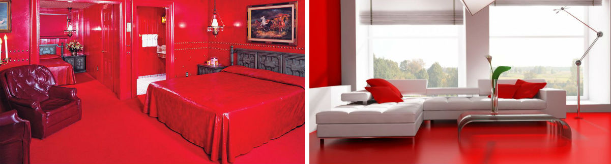
Do you believe it now? Same with laminate flooring indoors. In the morning, in daylight, the floor covering appears to be one color, and in the evening at sunset it appears different, and completely different when the electric light is on, as, for example, in these photographs. In the first photo the floor seems red, in the second it looks light brown, although this is the same room, the same material.

In a word, our perception of color largely depends on light sources, the main of which is sunlight, which is either absorbed by objects or reflected from them, falling on the retina of our eye. Each eye contains approximately 37 million light-sensitive receptors. We see light, which physicists call "white", but in fact, if we look at it through a prism, it becomes rainbow, colored, or spectral, and consists of waves of different lengths, each of which is distinguished in different parts brain Color can influence our well-being, mood, heartbeat, brain activity and even hormones. However, our attitude to color is individual.
Rules for choosing laminate color that you should not forget about
Rule No. 1. Cardinal direction
The same laminate will look different in different lighting. There is no point in choosing the same laminate for the entire apartment, and especially for a house if the rooms in it face different sides. Therefore, the first thing to consider when choosing a laminate is which side of the world the windows through which light spills into the room face. Remember that the same laminate on the south or west side of the house will look brighter and redder in the evening than on its opposite side.

By the way, the Taoist teaching of organizing space - Feng Shui - speaks about the same thing: if a room on the south side of the house is painted red and the floor is laid with mahogany laminate, there will be an excess of fire energy, which will cause increased irritation and aggression in the house. That is why it is extremely important to achieve balanced combinations in the interior, so that the shades of finishing materials balance each other and do not come into conflict with each other and nature.
On the left - there is clearly an excess of red, on the right - the red floor acts as an accent
The general rule is this: in the eastern and northern rooms there is less sunlight, so they appear darker and colder, especially in the afternoon, when the west side of the house is brightly illuminated by the sun. In general, rooms with windows facing south or west receive more sunlight, so laminate flooring in them can be purchased in cool tones. But the dim northern and east rooms need bright, energetic colors, so you should choose laminate flooring in warm color palettes.
Rule No. 2. Texture of material
 Remember when we said that light is reflected from the surface of objects or absorbed by them? So, not only the color, but also the surface and texture of the laminate interact with light differently. Glossy laminate reflects light, while matte laminate absorbs it. That is why laminate of the same color, but with different textures, looks different in the interior.
 Taoist teaching also mentions texture and helps determine between glossy and matte flooring surfaces. Gloss contributes to the too rapid flow of qi energy in the house, which can negatively affect health, sleep, relationships and even finances, so it is not recommended to install glossy laminate in bathrooms, kitchens, bathrooms and long corridors, as well as in rooms with drafts. At the same time, in rooms where there is stagnation of energy, for example, overloaded with furniture, glossy laminate is ideal.
In addition, a glossy surface can visually enlarge the space, so with the help of such a laminate you can balance the configuration of a small, narrow or geometrically complex room.
Rule No. 3. Geography of residence
It must be remembered that quality and intensity natural light also not the same in all regions. If we lived in Africa, we might not need bright, rich interior colors at all. In this case, we would like to hide from the mercilessly scorching sun in some wooden shack. That is why in the south of Russia (as well as in rooms facing the south and west) laminate flooring in gray-brown, pale beige tones and all cool shades is appropriate.
But since the residents of the European part of Russia lack the sun like air, not to mention the residents northern regions, then the gray-brown range of shades, when used in excess, can even cause depression, so laminate flooring for mahogany or mahogany, as well as red, red, terracotta and all warm shades are more appropriate in the interior.
If you want to use laminate with patterns and photo printing in the interior, keep in mind that soothing blue shades look good in coastal and sea areas (in the south of Russia), but in industrial and residential areas (most of Russia) they look rather dull.
Rule No. 4. Purpose of the room
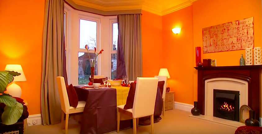
 It is important to remember that certain colors suit certain rooms. Thus, numerous studies show that red color excites the nervous system and activates brain function. Yellow and orange have a similar effect. These are strong colors that have some kind of physical effect on people, awakening the appetite and increasing the heart rate. That's why red laminate isn't the best best solution for bedrooms where peace and relaxation is required. But in the kitchen or hallway, red, orange, and yellow look very organic.
Thus, when choosing the color of the laminate, consider the purpose of the room and what this or that room is used for. If for relaxation (bedrooms, bathrooms), then it is better to choose calmer, pale, cool shades of laminate. If the room is designed for communication (kitchens, living rooms), then you can use more energetic colors on the floor. Saturated colors are also suitable for rooms that are little used or in which occupancy is not constant (corridors, halls, closets, dressing rooms).
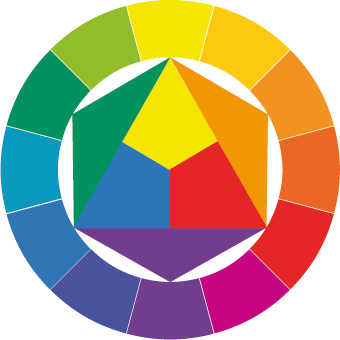
Rule No. 5. Chromatic circle
The perception of the color of laminate in a room is influenced not only by external and internal lighting, but also by the surrounding color scheme, both in the interior and outside the window. In addition to the laminate, in one room there are walls, a ceiling, a view from the window, the windows themselves, doors, furniture and furnishings, and they all have some color. In combination with them, the color of the laminate may acquire shades and undertones that are different from the color by which you chose it in the store, so it is better to immediately take into account possible errors.
To do this, let's turn to the basics - the chromatic circle. For example, let's take the traditional chromatic circle RYB. It got its name from the first letters of the three basic colors on English: R ed (red), Y ellow (yellow) and B lue (blue). The remaining colors are obtained by mixing them.

Half of the presented shades are warm, the other half are cool. But all these shades are somehow combined in the brain’s neural center. Want to check? Look at the red laminate for a couple of minutes, and then look at white wall. You will see green highlights on it for a long time.
Why is this happening? Now look at the chromatic circle again: red and green are on opposite sides. These are contrasting shades, or, more correctly, complementary colors. We already identified three colors at the beginning, remember? Here are their complementary colors, located on the opposite side of the circle: red - green, yellow - violet, blue - orange. The remaining shades and halftones on the circle also have their own pairs.

In the interior, all colors, being with their pair together in the same room, enhance each other’s color. They become brighter, more saturated. So, red laminate will look even redder if there is an evergreen lawn outside the window of your house. And if you have chosen a blue-colored laminate, then remember that together with the orange decor in the apartment it will look much brighter.

If it's a living room or a creative workshop, why not? But if you choose such a laminate for a bedroom where you need to get enough sleep regularly, you should opt for something calmer or change the wallpaper.
We create a harmonious interior
If you need to liven up your interior, simply use colors that are located opposite each other on the chromatic circle, i.e. additional (complementary) shades. If you are looking for harmony in the interior, dreaming of comfort, then you should use colors from the same family. There are three color families:
- red, yellow and orange formed when they are mixed;
- red, blue and violet formed when they are mixed;
- blue, yellow and green formed when they are mixed.
They are clearly shown on this chromatic circle.
Each color has a tone: from lightest to darkest. If we use colors of the same family and the same tonality in one interior (that is, equally light, equally deep/saturated or equally dark), we will get a harmonious and balanced interior, as in this photo.
From the point of view of a harmonious combination of colors, you can use different shades of the same color in the interior, for example brown or beige, but in this case we risk getting a faded and boring interior. Bright accents or original texture of materials will help save the situation.
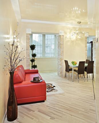
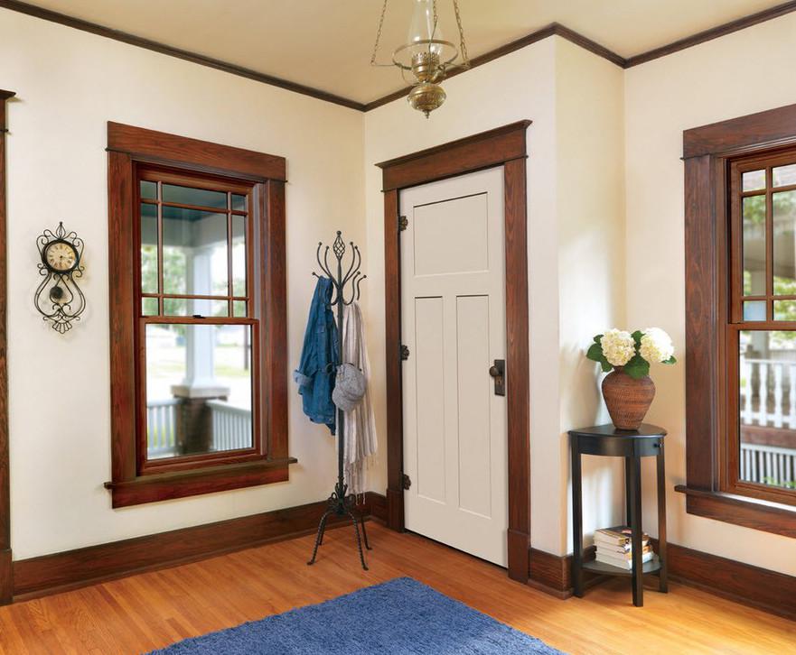
Rule No. 6. Combine the color of the laminate with the color of the doors
Designers recommend choosing a laminate of the same color as the door or a contrasting color. In the first case, this design looks especially good with contrasting walls in long narrow corridor, where several doors open at once, as in the photo below.

In the second case, the door should match the color of the furniture or decorative inserts on the laminate or match the color with other decoration in the interior, as in the following photo.

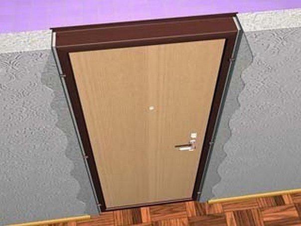
Rule No. 7. Combine the color of the laminate with the color of the baseboard
If the color of the door, trim, baseboard and laminate in one room is different, then from a design point of view this will become a real disaster in the interior, full of mismatch and artistic imbalance. Almost like here:
Laminate and baseboard of the same color

Skirting of the same color as the doors

Skirting to match the color of the trim
Skirting to match the color of the walls/wallpaper

Fashion trends and new technologies
It is not a rule as such, but, in fact, the color and style of the laminate is dictated to us by the manufacturer himself, and by the mood in society. During times of crisis and depression in the country, people tend to choose neutral shades to decorate their interiors, including gray, beige, black and brown laminate. The manufacturer is forced to adapt to the mood in society, offering appropriate laminate collections.
During a period of economic growth, a positive worldview, a spirit of patriotism, a feeling of freedom, and creative ideas reign in society, as a rule, so you want to surround yourself in the interior with more bright colors, and the choice falls on laminate in bright, warm and rich colors.
Plus new technologies are appearing, laminate with interesting decor, imitations, textures that suggest new interior solutions to designers. This is how mahogany came into fashion, then for some time the shades of cherry, olive, and chestnut were popular. With the advent of new technologies, not so much colors as unusual laminate textures have become fashionable: brushing, rustic embossing, sawing effect, imitation cracks, 3D, synchronous embossing, imitation tiles, reptile skin, glossy finish.

Optical illusions in the interior
Due to the peculiarities of our color perception and visual color effects, correct use colors in the interior will help correct the geometry of the room:
- visually increasing its ceiling if necessary;
- expanding the boundaries of a narrow room;
- moving an overly large and uncomfortable space;
- mirrors/gloss correcting incorrect floor geometry or increasing space;
- distracting from the shortcomings of the room with bright blocks of color.
The latter technique has gained extraordinary popularity. Its main advantage is accessibility and ease of use. So, if you want to distract attention in a room from a low ceiling or other drawback, simply use red or other bright laminate in a neutral frame, then everything else will fade into the background.
Correcting the geometry of the room with the color of the laminate
By general rule all light and white shades visually enlarge the space, expanding it. That's why such interiors seem spacious. Dark and black shades, on the contrary, visually make the room smaller, and when there is an excess of them, they cause a gloomy mood. Experimenting with color palette indoors, you can achieve amazing effects by knowing the influence and power of dark and light shades and their combinations. Here are simple examples.
This room looks, without a doubt, spacious. But using white alone in a room can resemble an uninviting hospital interior. Nevertheless, this is a good, and sometimes the only right solution for very small rooms in “guest rooms”. In addition, light shades are abundant in Scandinavian interiors.

This combination visually increases the ceiling, but, unfortunately, narrows and shortens the room, so it is ideal only for large rooms with low ceilings, where there is a need to emphasize the plane of the horizon. If the floor is not covered with furniture or carpet, then a light floor can create a feeling of instability and lack of support, but if you put a carpet on it, it can feel like a cellar.

This technique is usually used in spacious rooms, since dark color tends to reduce space. In such combinations, it plays the role of an accent, like any bright/contrasting spot in the interior. In some cases, with its help it is possible to somewhat enhance the depth of the room or zone the room.

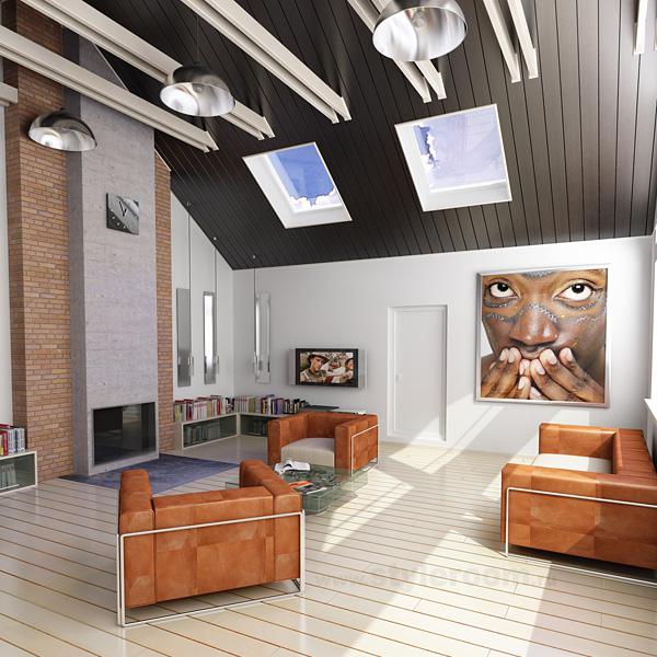
This technique is best used in rooms with irregular geometry, sharp corners, columns, which is often found in modern monolithic houses. The dark color draws attention to itself, distracting from the protrusions in the room, which, thanks to the white color, become barely noticeable. In this case, light laminate flooring and ceiling help to pull the room up.
This combination visually reduces the size of the room and lowers the ceiling, while the light floor creates a feeling of instability. Nevertheless, with the correct arrangement of furniture, selected decor and lamps, you can achieve balance in such an interior.
Light laminate and light walls create a feeling of space, visually expanding the room, but a dark ceiling visually reduces its height. This combination is relevant for rooms with irregular geometry, trapezoidal shape, as well as for non-residential premises, exhibitions, and galleries.
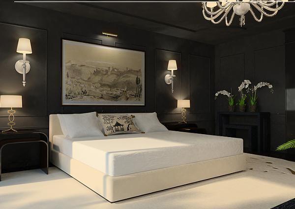
Ideal for most living spaces. Dark laminate creates a feeling of reliability and stability of the floor. The light ceiling seems higher than it actually is. And light walls expand the space, making it larger.

This combination is suitable for small and narrow rooms with high ceilings because dark laminate in combination with a dark ceiling, it reduces the height of the room, making it seem lower. Light walls, on the contrary, expand the room. This option looks good in “Stalin” cars.

This combination gives the apartment a feeling of a cellar, as if light penetrates only from above, through the light ceiling. A carpet will help brighten up this feeling. light shade on laminate.

Since dark color narrows the space, such a room seems much smaller than it really is. Nevertheless, in combination with stylish decor, photo wallpaper and proper lighting, in some situations this design looks appropriate and harmonious. Most often, this technique is used by cafes, clubs and other public institutions. Of course, the room for this must have enough volume so that there is something to reduce.

Laminate and 8 main styles in the interior
Scandinavian style in the interior is characterized by freshness, coolness, white colors and a lot of light - daylight, electric, any kind. Lightness, a certain amount of romanticism, open spaces and a lot of air. So bright and spacious interiors Scandinavians are trying to compensate for the lack of sunlight. Many details and accessories add coziness.
Use laminate in the lightest colors: frosty, white, weathered, arctic, limestone, ivory, blonde, platinum, northern, bleached, Alaska.
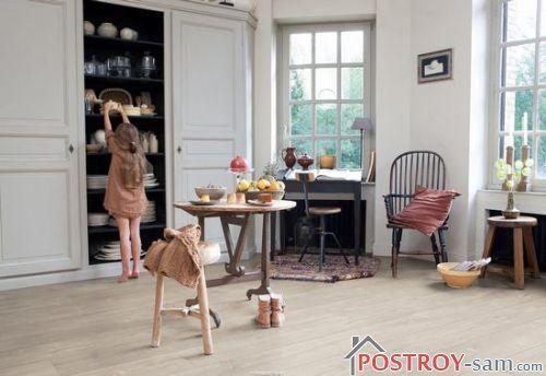
Natural beauty in country style. The interior is suitable for cottages, village and country houses. Natural shades of wood in the design of walls, ceilings, floors. The interior looks natural and as close to nature as possible. Fits well into eco-design.
Use laminate in natural shades: oak, pine, wood, country, vanilla, lounge, loft, pebble, natural, spring.
Art Nouveau interiors use soft and delicate cotton tones and combinations. The choice is made in favor of natural lines and textures, including velvety ones.
Use laminate natural shades: natural, cotton, cedar, glaze, ivory, sequoia, quartz, cream, sand, almond.
Home distinctive feature this style is natural brickwork, which decorates at least one wall in the room. In another way, this style can be described as “City Lights”, or industrial, urban. Suitable for residents of big cities. Modern style for modern people.
Use laminate in gray tones: ash, concrete, silver, gray, quartz, slate, breeze, smoky, platinum blonde, dark gray, silver, silver gray, bleached oak, stone.

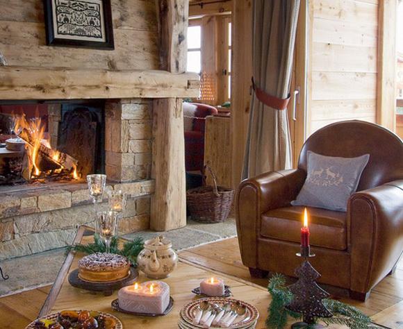
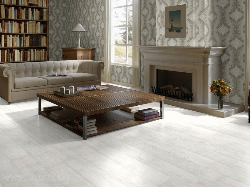
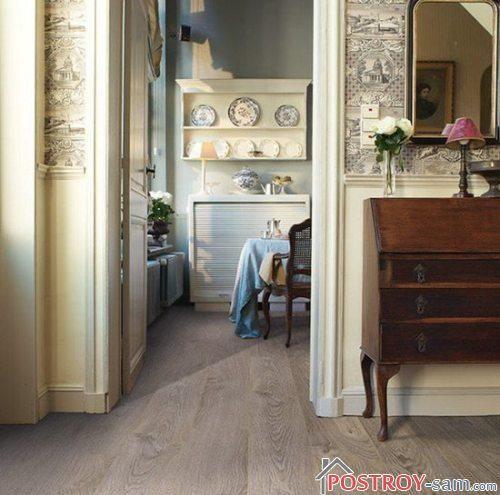
Traditional style is the choice of many homes. It is based on rich brown. Classic furniture, traditional decor, conservatism of lines, familiar images and outlines. Rich interiors in warm rich colors.
Use laminate in rich brown shades: oak, teak, flounder, amber, suede, honey, chestnut, magnolia, nutmeg, golden, barley, cappuccino.

Retro style in the interior reproduces the past. Distinctive furniture and original details help turn back time. This could be a 20s style interior with a touch of luxury and patina on the walls, or a 50s-60s style with polished surfaces and a bold color palette. A glossy laminate that imitates polished artistic parquet is suitable.
Use laminate in red, caramel and aged shades: vintage, castle old, seasoned, golden sunset, golden, golden honey, sawn, frappuccino, impresso, chestnut, old oak, cracked, antique, shabby.
Exotic African motifs in the interior help to revive it. Warm dark chocolate decors and distinctive accessories create a spirit of travel and the magic of adventure.
Use laminate in dark brown and chocolate tones: prestige oak, black walnut, hardened oak, resinous, wenge, African, ash, zebra.
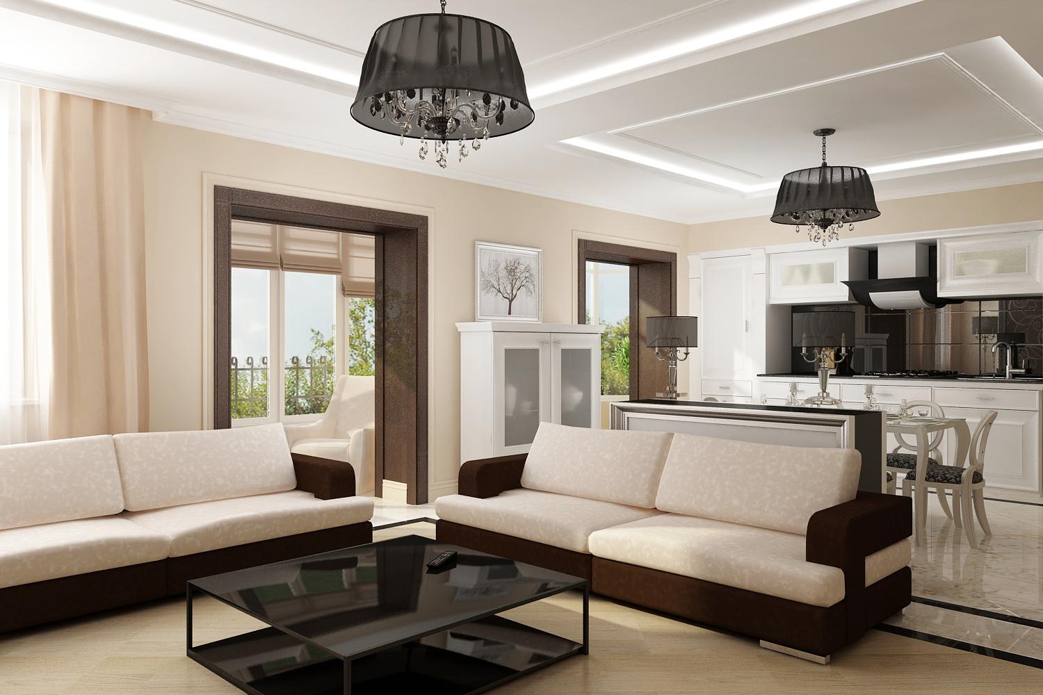
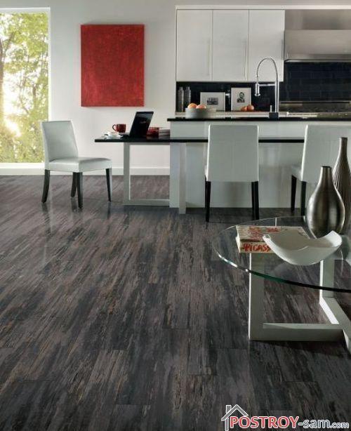
The interior uses plastic, metal, glass, strict straight lines and high technology. The style expresses prestige, image, solidity and respectability, suitable for offices and sophisticated home interiors.
Use laminate in the darkest shades: dark gray, black, wenge, slate, anthracite, basalt, stone, resin, concrete, coal, midnight, mica.

Laminate color in the interior: meaning, mood, atmosphere
In many ways, the color of the entire interior is influenced by the color of the floor, in our case, the laminate. The color of the floor is especially important because we walk on it, which means we either feel the confidence and security of our position, or its instability, which is achieved by the color of the laminate. It is the color of the laminate that creates the primary harmony in the interior. Almost every color can be used in both cold and warm interiors.
White color symbolizes purity and innocence and promotes new beginnings. He is like a blank canvas on which you can draw anything. A light laminate in a room expands, increases the space on the floor, lets more light into the room, and adds volume to it.
Positive associations: freshness, light, eternal values, airiness.
Negative associations: coldness, severity, lifelessness.
Main shades: cream, ivory, seashell, magnolia. In laminate, this color is presented as blonde, patina, silver.
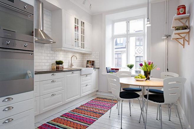
Suitable for: living rooms, kitchens, fireplace rooms, bathrooms, halls, bedrooms, Scandinavian style.
In combination with white and blue walls it looks arctic cold.

In combination with brown and other warm or neutral shades in the interior, white or light laminate will look warmer.
A modern color that can be either neutral, background, or very fashionable, leading in the interior. It is very often found in nature and therefore has become a favorite color of designers when decorating modern urban interiors. Despite its coldness, it can become part of the interior in warm colors.
Positive associations: calm, elegance.
Negative associations: dullness.
Gray laminate has dozens of shades: steel, lead, basalt, anthracite, slate, mica, feldgrau, stylus, granite, coal, silver, mother-of-pearl, wet asphalt.
Suitable for: living rooms, kitchens, halls, hallways, bedrooms, offices, cabinets, high-tech interiors, loft style, exotic rooms, colonial interiors.
Gray laminate as part of a cold interior:
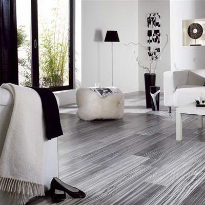
Gray laminate in a warm interior:

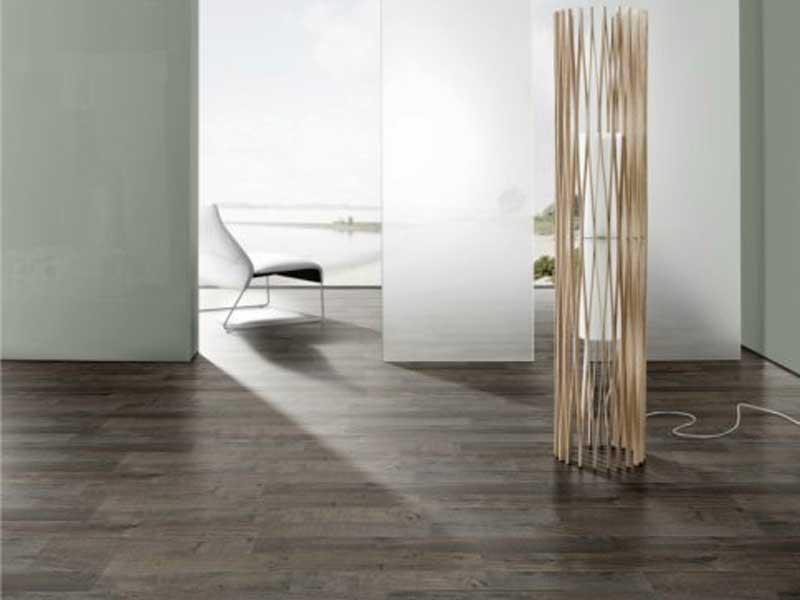
Black is the color of independence and strength, full of mystery. With the help of black laminate you can create stylish and elegant interiors. Depending on the surrounding colors in the room, it can represent luxury, contrast, prestige, extravagance or even pathos.
Positive associations: mystery, intrigue, style, strength, attraction, luxury, elegance.
Negative associations: darkness, gloom, sadness.
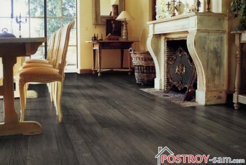
Basic shades and pigments: soot, coal, graphite, burnt bone, carbon. Black laminate is represented mainly by wenge and its varieties.
Depending on the shade, it is suitable for: bedrooms, teenagers' rooms, kitchens, dining rooms, halls, hallways, high-tech interiors, urban style, colonial style, exotic in the interior.
Black laminate in the interior in cool colors:

Black laminate in a warm interior:

The color of earth, natural nature. It has become widespread in interior design.
Positive associations: safety, stability, comfort.
Negative associations: depression, old age.
Brown has dozens of shades/pigments: umber, bistre, copper, red, ocher, sepia, light brown, brown, hazel, brick, light brown, chamois, coffee, wheat, burnt sienna and others. Brown is the main color of laminate that imitates natural wood, so its shades are limitless.
Depending on the shade, it is suitable for: offices, halls, corridors, hallways, fireplace room, living rooms, libraries, rustic style, classic style, English style, colonial style, country, retro, loft interiors, modern style, eco-design.
Brown laminate most often contributes to the creation of warm, cozy interiors, like in this picture.

But clear example how brown laminate can become part of a very cool interior in combination with white/gray walls, furniture with metal legs and a minimalist style.
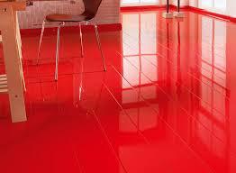
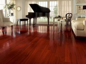
Red is the primary spectral color with the longest wavelength. An ambiguous and risky color that sometimes you want to stop, so in interior design it is often used as an accent. It reduces the size of the room, but increases the size of individual objects that are emphasized in the interior.
Positive associations: warmth, energy, prosperity, passion.
Negative associations: war, blood, fire, aggression, anger, hatred.
Red has dozens of shades/pigments: scarlet, ruby, burgundy, carmine, crimson, magenta, cardinal, fuchsia, rusty, crimson, chestnut, garnet, coral, pink and others. Red laminate is available in both wood-like shades (mahogany, mahogany) and modern shades.
Suitable for: kitchen, dining room, hall, living room, study, colonial style.

In combination with beige and light brown paints, warm shades of red laminate help create cozy interior imbued with luxury. Laminate with the texture of mahogany, mahogany, merbau or cherry is ideal for these purposes.
Energetic color, strong, promotes communication and awakens appetite.
Positive associations: happiness, joy, intelligence, cheerfulness, communication.
Negative associations: rebellious color.
Basic shades: orange, honey, amber, carrot, chestnut, rusty, red, pumpkin. In laminate it is represented mainly by red shades of brown with imitation of wood textures.
Suitable for: living rooms, dining rooms, hallways, vintage style, retro design.
Most often, orange laminate becomes part of a warm, cozy interior. This is facilitated by walls painted in warm colors, furniture in warm colors, energetic decor, wooden windows and doors.

However, in combination with light walls and metal elements In the surroundings, the brightness of the orange laminate is slightly muted.

Laminate flooring in warm beige and yellow tones helps create calm, peaceful interiors full of harmony. Depending on the hue, depth and richness of beige or yellow laminate, it can create both neutral and more cheerful interiors.
Positive associations: sun, serenity, optimism.
Negative associations: selfishness, arguments.
This color group comes in dozens of laminate shades, including acacia, oak, birch, beech, maple, ash and other natural/neutral tones.
Depending on the shade beige/ yellow laminate suitable for: living rooms, bedrooms, kitchens, hallways, corridors, dining rooms, offices, loft style, country style, modern style, rustic style, modern interiors.
This is a universal and easy-to-maintain laminate that does not show defects and is unlikely to get boring. Neutral shades may seem boring, but bright accents in the interior offset this drawback.
Beige laminate in warm colors can become the basis for a cold interior.
In combination with bright colors in the interior, beige or yellow laminate seems even warmer.

Many people think what to choose finishing material - this is the most simple task, but as practice shows, this is one of the key stages of repair and the result depends on it. How much controversy the process of choosing materials for repairs generates! If a man chooses wallpaper or flooring based on the quality of the product and its price, then a woman, first of all, pays attention to how the materials will fit the furniture or walls.
Introduction
Laminate has been the best-selling floor covering for several years now. If previously it was used by people with good incomes, today this flooring is spread almost everywhere: hallway, living room, bedroom, room, kitchen, work rooms, country houses and dachas.
When choosing a laminate, you need to follow several rules, and the main one is - this is compatibility. The coating should be suitable not only for furniture, but also for wallpaper. When choosing a laminate, you need to consider following parameters: his technical specifications( , moisture resistance, etc.) and decorative properties( , texture, form ).
§ 1. We select laminate to wallpaper by color
The color scheme of the laminate should be combined with general style rooms. A huge range of products is constantly updated. Now you can choose not only the color or pattern, but also the texture: laminate can imitate solid boards, stone, wood, ceramics and other materials.
It is important to select a laminate not only taking into account the color of the furniture in the room, but also taking into account the color of the wallpaper. Planning a living room in light colors - Choose a light laminate for wallpaper too.
Never buy flooring that matches the walls: wallpaper, decorative plaster should differ by 3-4 tones from the floor and not merge at the junction.
The darker or further north the room, the lighter the flooring should be. Light laminate and wallpaper make the room visually larger, cleaner and serve as the basis for the most daring design solutions.
The second rule is for wallpaper and laminate. You can buy light wallpaper to match a light laminate, but you cannot combine light flooring with dark or black wallpaper.
§ 2. Disadvantages of a bright room
When they want to make an impression, to emphasize luxury and solidity, they buy furniture in dark colors. However, in recent years The so-called “Scandinavian style” became very popular. A light floor makes the room simpler, but at the same time more comfortable and homely. Although it is not suitable for an elite interior, it visually increases the space.
Owners often dream of a snow-white floor with a coffee tint, but in reality the floor turns out to be white with a yellowish tint, and the result is not quite the effect that was expected at the very beginning. Therefore, if you do not want to see yellowness on the floor covering, then pay attention to floors with a blue or grayish tint.
Not every light laminate looks natural; it happens that cheap flooring has appearance linoleum. Pay attention to the light laminate with a matte finish; you can choose a “semi-matte” finish.
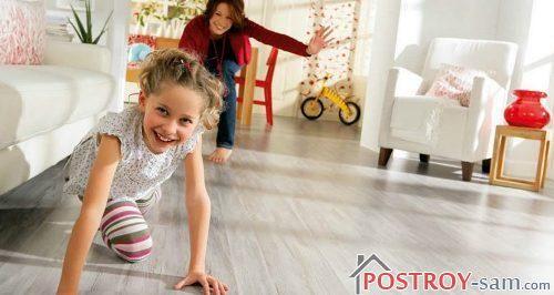
The main disadvantage of white laminate - it's dirt. If the apartment has: small children, animals, birds - That white doesn't suit you. It is better to choose a light laminate with a textured pattern, for example, wood effect - it's much more practical.
We have decided on the color schemes and chosen the quality or class of the laminate - Now you need to decide when and how to lay this laminate on the floor, and at what stage to glue the wallpaper.
§ 3. Repair work. What comes first: wallpaper or laminate
This question arises for everyone who starts renovation: what comes first, wallpaper or laminate, what do they do first? By and large, you can do it in any order convenient for you. However, experts, answering the question of whether to go ahead with wallpaper or laminate, still recommend starting with wallpapering because:
- If you lay the floor first and then glue the wallpaper, you may end up with glue stains on the laminate, and the floor can be scratched or damaged by a tool. No matter how carefully you do everything, a drop of glue, fasteners, a hammer or other object will still fall on the laminate. At best, you will need to go through with a brush and scrub everything off, at worst - re-lay part of the covering.
- When wallpaper dries, as a rule, a “greenhouse effect” occurs - at closed windows High humidity forms in the room, which is detrimental to laminate flooring with a low degree of moisture resistance.
§ 4. Sequence of actions during repair work
All renovation work you have to start from the ceiling. If you do the ceiling after the walls or after the floor, you will see how the whole room will be splashed with paint or other ceiling coating. The exception is a suspended (suspended) ceiling; it must be done at the very end of the repair work.
Next comes the wall. If this is wallpaper or decorative plaster, then it should lie on the wall before you make the floor. All repairs should be done when the rough work has already been completed. If you plan to replace pipes, windows, and wiring, then do this before wallpapering, otherwise there will be no trace left of your repair.
The last step is the flooring. Laminate flooring in a clean, tidy and prepared room. By that time, the wallpaper should already be dry and stick well to the wall. It is recommended to buy along with the laminate; it will hide all the unevenness of the cut wallpaper at the joints. As a rule, the baseboard is chosen in the same color scheme as the laminate. If you don’t see exactly the same baseboard in the store, then you can take it with a different pattern and 1-2 shades darker or lighter - it will not catch your eye.
Conclusion
And finally, a couple of tips from designers. White ceiling, white wallpaper, white floor - beautiful, but reminiscent of a hospital, try to dilute the color scheme with bright decorative elements. You can choose a baseboard that is not tone on tone, but it should be in harmony with other finishing elements in the room - for example, with a door leaf.
Apartment design
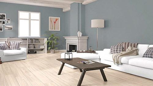
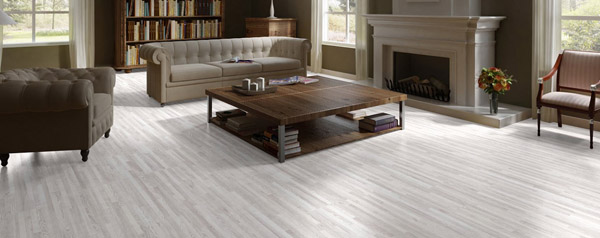
IN lately professional designers, and just amateurs beautiful interiors They shift their interest from boring wenge, classic bleached oak and sore cherry. Where did their eyes go? If we take into account only laminated floor coverings, then laminate in gray and light brown tones is at the top of popularity. And even considering that gray laminate in the interior looks quite complex, this choice will become great solution in the design of your home.
If you are really tired of the classic options, in particular for such a fundamental case as flooring, then we recommend considering this type laminated coating. On at the moment this color is not yet so often found in the apartments of our relatives and friends, despite the fact that many companies offer wide choice gray laminate with various shades and textures. Making a choice from such a variety of gray colors is not at all difficult.
Psychological influence of gray tones
Gray is a rather complex color. Some people attribute it to dull and boring tones, while others generally claim its overwhelming influence on the psyche. However, scientists have long proven that gray color can have a calming effect on a person, providing a calming effect and restoring after stress. In addition, studies have shown that gray tones cannot be boring.

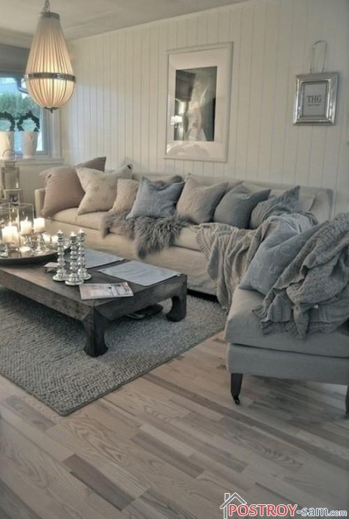
Gray laminate in the interior
The opinion that it is uninteresting and boring is completely wrong; in fact, it can be completely different. Therefore, by choosing a gray floor covering, you are at the very beginning of an amazing life path your interior!
You can compare gray laminate flooring to an artist’s canvas, against which you can paint a picture of your future room. Such a floor allows the decor of the ceiling walls and pieces of furniture to take over the dominant influence, greedily absorbing and reflecting the colors used in the room.

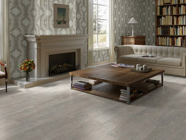
In gray laminate there is no simplicity, no excessive severity, no redundancy of the color of other wood shades. This color scheme of the floor exudes sophistication and nobility. Gray laminate, under its color restraint, hides a large number of possibilities for reproducing the ambience of the room.
Optical illusions, or a hundred shades of gray
Dark color has the property of visually narrowing the room, giving it strict and somewhat intimate characteristics, white - on the contrary, expands the space, adding light to it and blurring the boundaries. These are common truths known to everyone at least a little educated people. And it is precisely them that are used by designers who try to reproduce some optical illusions, thereby adding the necessary shades to the interior using the color spectrum of the materials used.
![]()
This statement is most relevant for the floor - since a large area flooring is in plain sight compared to the crowded walls and high ceilings; this is where the necessary accents are placed for the visual perception of the room. And here all the variety of gray laminate comes into play:
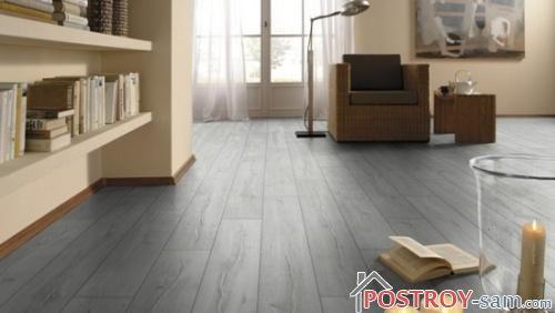
dark gray laminate, the color of graphite or wet asphalt, will add some contrast to the interior, but will also give the room dynamics;
light gray laminate or those with pearl shades will help you bring coolness, austerity and light to the room;
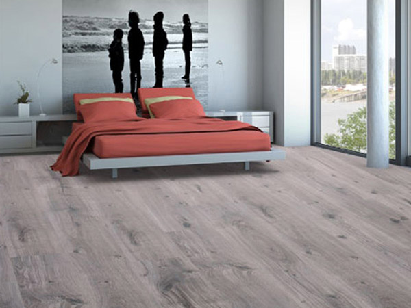
If the previous shades are too cold for your future room decoration, then you can choose a laminate in warm gray-beige or gray-brown tones.
You can choose the right shade of gray to suit any of your needs!
Style direction for gray laminate
Gray, as we said earlier, is a fairly universal color. Any environment can absorb this range of coverage and subordinate it to itself. However, there are some peculiarities here too.
Gray laminate in the interior looks most authentic if used: or modern classics. It is recommended to dilute this situation with active, courageous design solutions in decor, it won’t hurt and not through a measured set of chrome-plated objects - all of the above will give the room with a gray floor the necessary dynamics and make it unique.

This floor is also well suited for the kitsch direction - such a solution can put a pause on the design madness of this direction and organically combine individual elements.
Traditional styles, like antiquity, requiring widespread luxury, are not easy enough to solve problems using gray laminate. But even here, purebred types of wood, expensive textiles, and imitation of precious metals will help. By wisely combining bright shades and a gray floor, it is quite possible to obtain the necessary balance of all details as a result. And if we add pastel and silver tones to our color, we can get the perfect exquisite interior that will amaze your guests with excellent taste.
What wall design is suitable for gray laminate
There are often cases when people make a choice of flooring unexpectedly, and only after purchasing a gray laminate do they begin to think about the further course of the renovation, or more precisely, about the wall decor that may now be suitable.
At first glance, it may seem that the question is quite difficult, but deciding on a painting material for a gray laminate or choosing wallpaper for wall structures is not so difficult. As we have already said, gray color is quite versatile and can easily be adjusted to existing color schemes in the decor of your apartment.
However, even here it is better not to deviate from the color scheme intended by the laminate: if the floor is chosen in a warm gray tone, then the trellises should be taken suitable, and on the contrary, the cool tones of the gray coating will imply cold shades of the wall structures. However, there are exceptions to any rule: if you have taste and confidence, then you can try to carefully combine contrasting cool and warm tones.

What to Avoid When Choosing Gray Laminate Flooring
Yes, yes, unfortunately, there is something that gray laminate does not like in the interior. First of all, it is the uniformity of color tones, as well as textures.
The gray laminate on the floor must be supported by a bold trellis pattern, metallic shine and bright splashes of color - this prevents the interior from turning into a dull and uninteresting environment, which is initially feared when choosing this complex and extraordinary color. Bright colors will help create a unique and interesting atmosphere.
If you nevertheless decide that the entire decoration of the room must be decorated in gray tones, then the play of gray texture is extremely important: glossy and mirror surfaces, plaster, textiles, many patterns, the flow of dark shades into light ones and vice versa. Work only with gray– it’s difficult, it’s much easier to bring additional colors into the room. However, well-executed, monochrome rooms look chic.
If you are trying to make your apartment special and not trivial, then choosing a gray laminate flooring is a very successful design step in the interior!
Currently, everyone who is interested in interior design, as well as designers themselves, are increasingly trying to avoid the long-tired wenge, traditional and rather boring bleached oak and disgusting cherry. But what remains in this case? If we consider only laminate, then now laminate in gray and beige shades is at the peak of fashion.
From the outside it may seem that gray laminate in the interior is quite complicated, but in fact such a choice will be great solution for decorating an apartment.
In the event that you are really tired of all the traditional solutions in such an important issue as the choice of flooring, you should turn your attention to laminate flooring made in gray tones. In the apartments of our compatriots, this color can be found quite rarely, but now many manufacturers offer a large number various variations laminate in gray shades. Therefore, it will not be difficult for you to choose from all the variety one that is right for you.
How does the color gray affect people?
Gray color is quite ambiguous. Many people consider it mediocre and dull, others even claim that it has a depressing effect on the human psyche. But scientists have long proven that it is the gray color that has a calming and beneficial effect on the human psyche, relieves the effects of stress and has a calming effect. In addition, studies have shown that gray shades do not tire a person at all.
No boredom with gray laminate
The existing opinion that an interior that includes gray color is dull and boring is absolutely not true, since gray color can be quite varied. If you decide to opt for gray color, then in the end you will get an amazing interior.
Gray laminate is only a canvas on which you yourself will paint a picture of the future interior, since a floor made in gray backgrounds gives the main role to furniture and flooring, while at the same time it greedily absorbs and then reflects all the colors that were used in the room.

Gray laminate has neither the excessive simplicity of white, nor the severity of black, nor the excessive color of other shades of wood. In choosing this color there is only grace and nobility, as well as laconic restraint. Such a laminate mysteriously hides a large number of wonderful opportunities for implementing their future interior.

Black color can visually narrow the space, and gives the room a slightly intimate and austere look. Light colors, on the contrary, fill the premises with light, expanding it and erasing boundaries. This is known to everyone who is even slightly familiar with the laws of physics. Designers, in their desire to create any optical illusions in a room or give it the necessary shades through the use of a certain color scheme of the materials used, are guided by these very laws of physics.
This applies most of all to the floor, since the walls are usually filled with something, and it is located quite high. Most of the floor is most often visible and is able to place all the necessary accents in the interior, which are possible thanks to the huge variety of gray shades:
- if your room needs to add austerity, light and coolness, then a laminate with a pearl or light gray tint will help you with this;
- if you need to make the interior more dynamic or give it some contrast, then a laminate of graphite or dark gray color, as well as the color of wet asphalt, which can be covered with light frost, will do the job perfectly;
- in the event that all proposed color solutions seem too cold to you, then you should think about warm laminate colors such as gray-beige or taupe.
It doesn’t matter what exactly you decide to do in your home - the gray color of the shade you need will be found in any case.

As already written above, gray is a universal color. The interior happily absorbs the gray color, which then begins to work for it. True, there are some nuances here.
Gray laminate looks very harmonious in interiors designed in modern, hi-tech, modern classics or in Scandinavian style, since these interiors need to be diluted with rich colors, as well as bold design decisions. It would also be a good idea to use a number of chrome elements, which can give the interior with gray laminate uniqueness and the necessary dynamics.
Gray laminate is also perfect for kitsch style, since the use of gray laminate will help to stop the madness at least a little of this style and connect disparate parts together.
The use of gray laminate in such classical styles as art deco, rococo and baroque, which require luxury in everything, can cause certain difficulties in implementing any ideas. But even in this case, the situation can be saved by the exquisite shine of silver, the shine of gilding, silk and velvet, as well as expensive types of wood. By combining rich colors and gray floors, you can get the perfect balance of the entire interior, which can surprise everyone with excellent taste.
Quite often, the purchase of flooring is made without much thought, and only after purchasing gray laminate do people begin to think about how best to decorate the walls.
It may seem that this issue is quite complicated, but choosing the shade of wallpaper or paint to match the gray laminate flooring will not cause you any particular difficulties. Gray is a universal color that will easily adapt to a wide variety of color schemes that you want to implement in your home.
When choosing a shade for wall decoration, it is better to stick to the color scheme that is determined by the floor, that is, if the laminate is made in warm tones of gray, then you should choose the appropriate wallpaper, and when choosing a laminate in cold tones, the walls should be made in cool shades. Of course, there may be exceptions. If you have subtle taste and talent as a designer, then you will be able to harmoniously play with the contrast of cold and warm tones.

There are some things in the interior that gray laminate is afraid of. In the first place is uniformity, not only texture, but also color.
A floor made in gray tones must be diluted with bright colors, bold ornaments and the shine of metal, as this will prevent the atmosphere from becoming boring and dull, which is very feared when working with this complex, but certainly very interesting color. Vibrant colors can make your interior rich, surprising and unique.
If, according to the design idea, the entire interior will be made in shades of gray, then it is simply necessary to play up the gray color with texture - many ornaments and patterns, the transition of dark to light shades and vice versa, gloss and varnished surfaces, as well as cement, fur, plaster and silk . Remember that it is quite difficult to work only with gray color, it will be better if you let the color into the room. But if the interior is done well, then even in monochrome it can look quite charismatic.

If you dream that your home will not be pretentious, but special, then gray laminate in the interior will be the right decision for you and your home.